


The Mercator map projection exaggerates the proportions of landmasses, especially the northern Hemisphere.
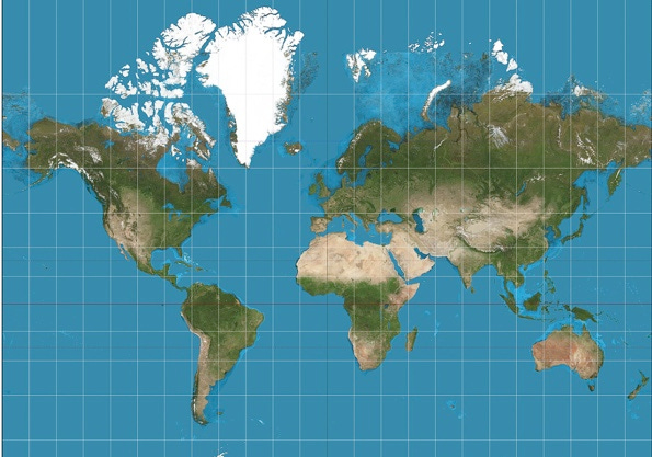
The True Size is an online interactive world map that helps to visualize the actual sizes of land masses.
You can check it out here: thetruesize.com
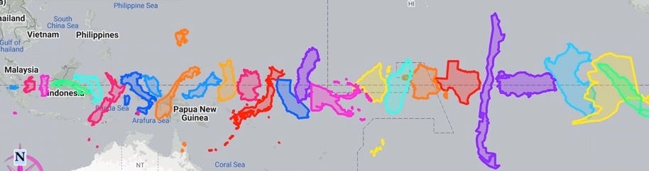
You can drag any country down to the equator line and watch it shrink in size to it’s correct comparative size. In the images below, I have done this with a few examples.
In order of size from left to right: Puerto Rico, Ireland, Portugal, Cuba, Florida, New Zealand, Italy, Malaysia, Norway, Finland, Germany, Japan, California, Sweden, Papua New Guinea, Spain, Madagascar, France, Texas, Chile, Turkey, Peru, Alaska
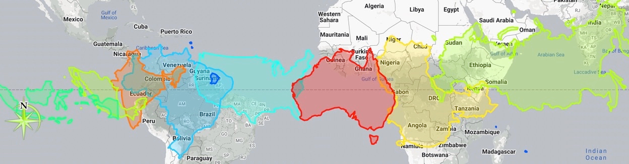
Indonesia, Mexico, India, Brazil, United States, Australia, China, Russia
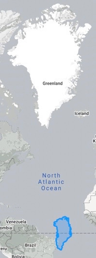
This is the true size of Greenland in blue (bottom) as compared with the incorrect enlarged Greenland:
Further Reading: Mercator Projection